What is the purpose of this infographic (teach, market, other)? It is to teach what makes us tic.
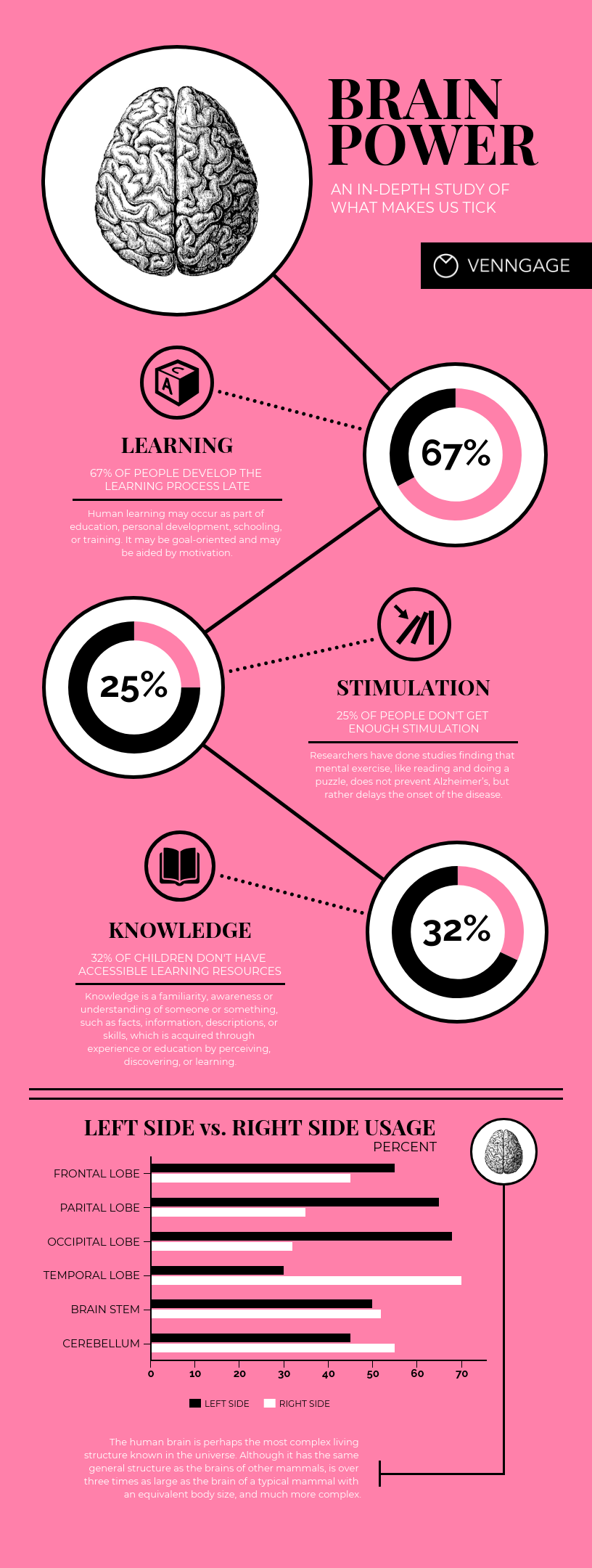
Does the infographic in your example have the 5 attributes of a great infographic (C.H.A.R.T.: Contrast, Hierarchy, Accuracy, Relevance, and Truth.)? If not, which one/s are missing? No, it is missing the "truth" aspect. The text and graphs contrast the background, there is hierarchy between the text and the charts, the graphs are accurate and the percents match the visual of the graph, the infographic is relevant because about 1.4 million people have tics in the US, the truth of this infographic may be wrong because there is no source of the data on the infographic. List 3 ideas you have for creating an infographic, be specific like compare and contrast nutritional information between a Big Mac and a Double Double. compare and contrast similar cars to purchase, a infographic on college debt statistics, infographic of all the methods to calculate the area/volume of functions
0 Comments
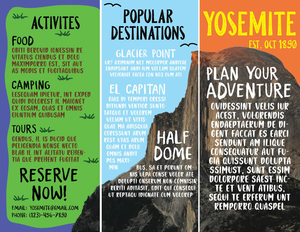 1. I think it can be a really efficient tool if you are frequently working with these types of works. I like it because its much easier to work with type, but it't harder to draw and make custom graphics.
2. I could use it to make brochures or invitations for businesses or parties. 3. It was pretty easy to use the interactive links. I put one on the "'RESERVE NOW!" that leads the user to the actual Yosemite reservation page. 4. We couldn't use Flipsnack. 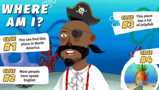
1. I think it could be used to make some activities or games more fun with animated characters.
2. It was easy, the website is very beginner friendly and was easy to navigate even though it was my first time using it. 3. I could use this to replace my face if I were making a presentation so it will be more fun for the audience.
 |
|||||||