|
1. What does a social media platform make money from?
By selling the attention of its users to advertisers. They grab our attention and keep us wanting more. 2. What is the difference between getting attention and paying attention? Going after attention makes you unhappy, but paying attention makes you happy. Getting attention shifts your focus onto other people, instead of focusing on yourself and doing things for yourself. 3. Can you become addicted to getting attention?, if so, how, and on a scale of 1 to 10 (1 being not at all and 10 being totally consumed) where do you fall in terms of being addicted to attention and do you think it's a healthy number, why? You can be addicted to attention because you can constantly desire more attention, and it can be a never ending amount. I think I'm a 2 because I try my best to not have attention. I think this is a healthy number because this allows me to focus on paying attention to others.
0 Comments
I found inspiring that design can dictate much of our lives and how we perceive things, sometimes completely changing our perspective on that object or app .
Some things that inspire me are my parents because I look up to them and aspire to be like them. The idea of success inspires me because I hope to be successful later in life. Modernity also inspires my art style because I prefer clean art that clearly gets its point across while also being very intuitive. Analyze:
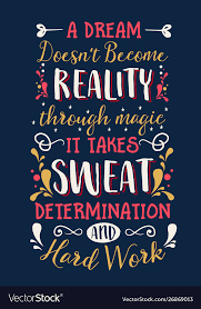
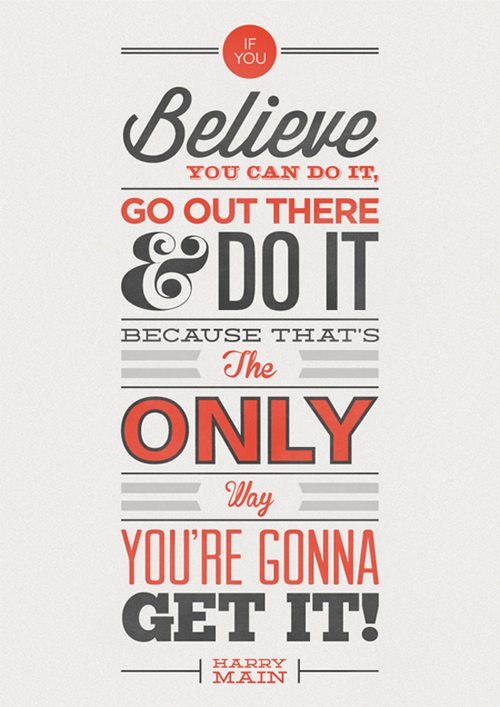
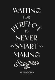
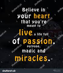
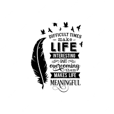
Both san-serif and serif are used, but usually, serif fonts are used. There are a lot of decorative fonts used but not for the whole quote. They're used to emphasize some keywords of the quote. Almost all the quotes I found used thicker/bolded fonts. They also used modern "rustic" fonts, like fonts that feel old-timey but they have a modern and clean design. I like how the quotes use many ways to highlight words of the quotes with font colors, size, and the font itself. Most words also have unique kerning and spacing between different words that move our eyes around the quote. 1. I think they look professional because they look clean with details. 2. I think they could be used as icon placeholders on store signs to indicate what they are selling. 3. I would have used a different color scheme and added more details to the pencil pouch because it doesn't really look like a pencil pouch to me.
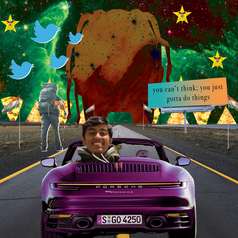
I noticed that most covers have a focal point of the main character. I also noticed that the backgrounds are almost always include explosions or some sort of visual effect, it is never a plain or unedited background.   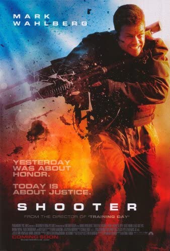 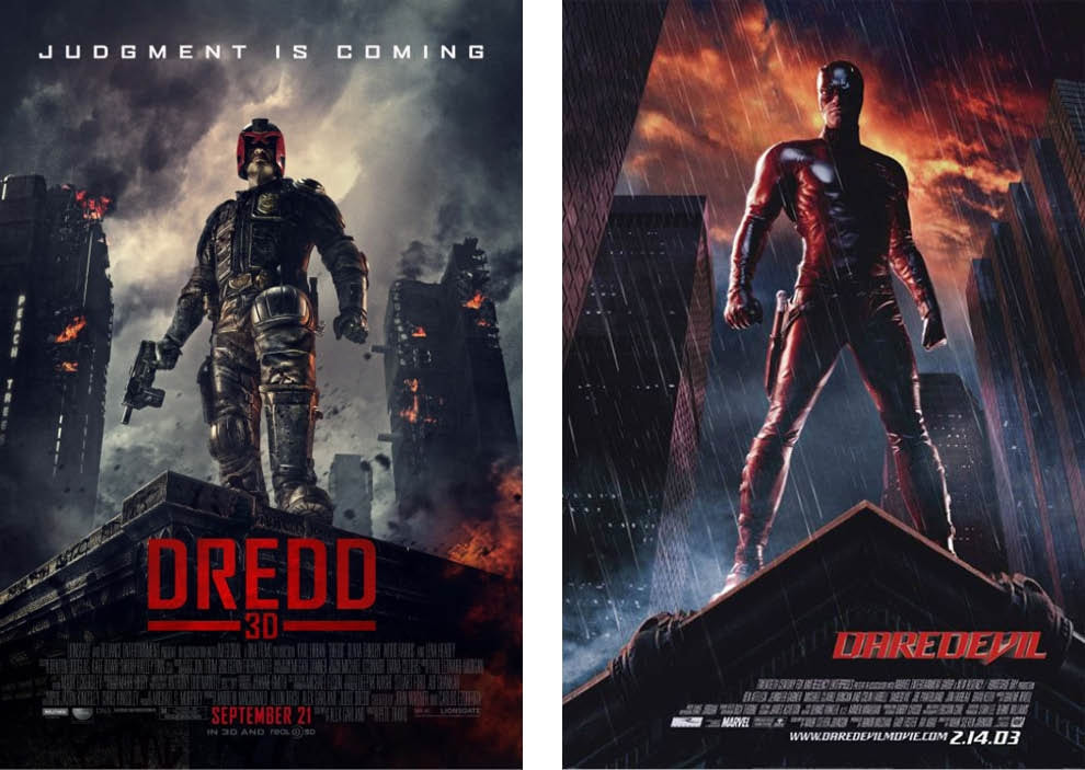 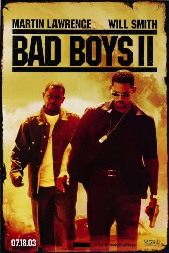 My favorite tip was the content aware tool because it can make many fixes much quicker and better looking. I like that my yellow-red gradient is beneath the pattern. 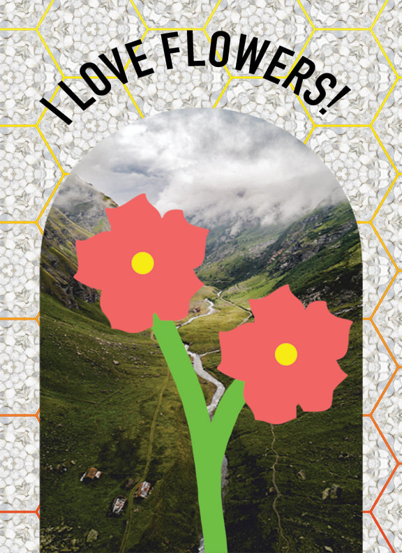 Rocket in spaceThis image uses closure and proximity . Closure is being used as the borders of the rocket aren't there, but we can make out the rocket from the empty space. I also used proximity by placing all the background objects close to each other to make the rocket shape very distinctive.  Where's the food?!I used 2 point perspective by creating the fridge with the perspective grid to make it 3d. Another gestalt theory I used was continuity with the animal legs which goes in a smooth path out of the fridge. 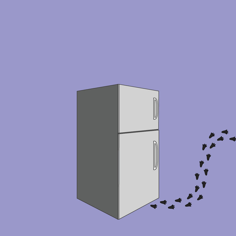 A Lonely FlowerI used focal point to focus on the sunflower in middle by using a different color and making it a bigger and different type of flower. I also used similarity to show the similarity of the tulips, but it also emphasizes the differences of the sunflower. I also used proximity by creating space around the sunflower. 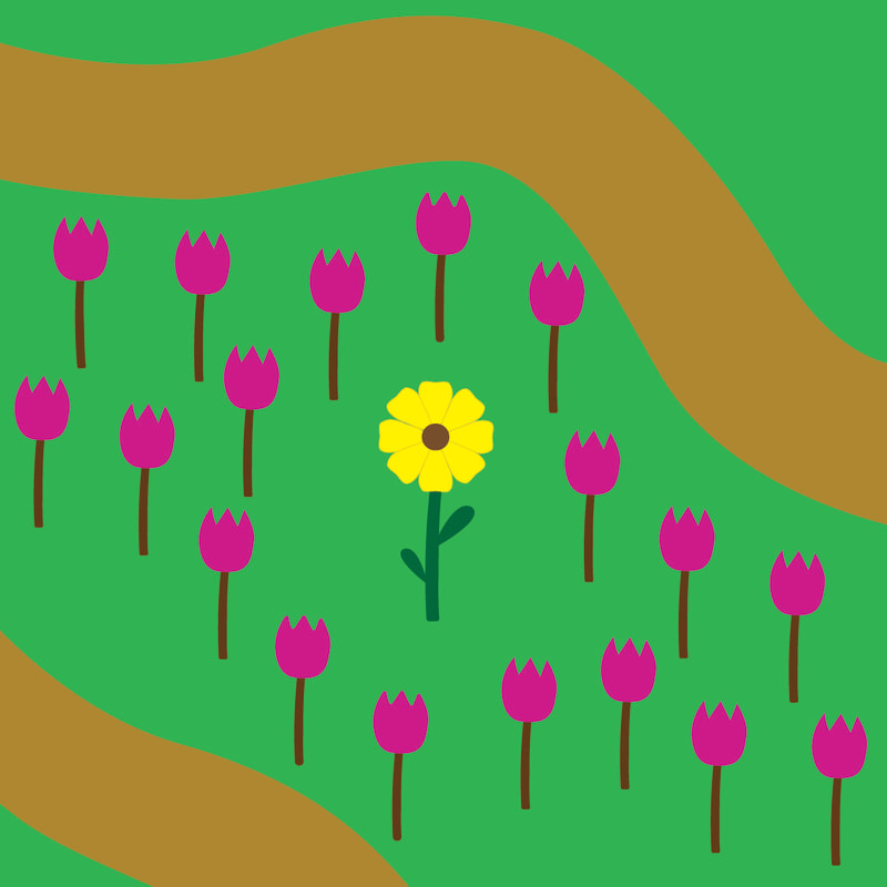 |